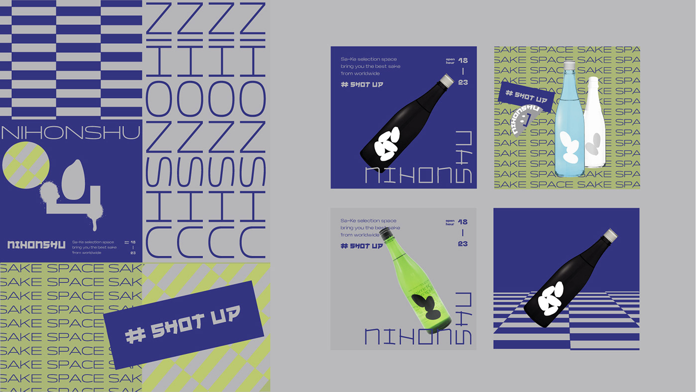
NIHONSHU SAKE SPACE
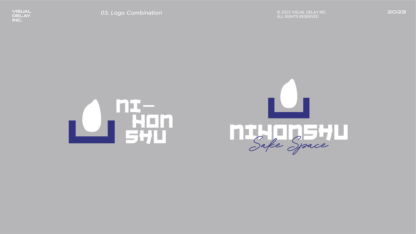
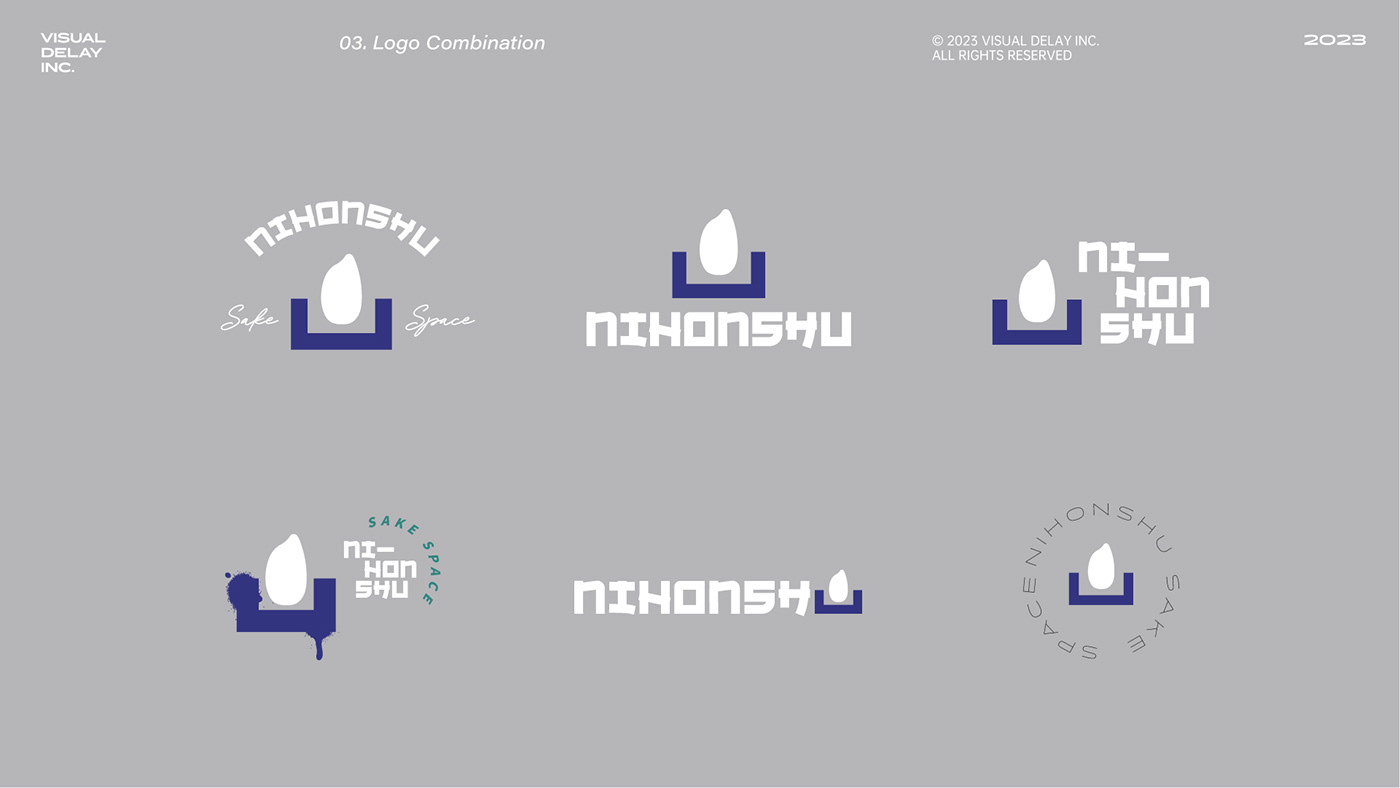
品牌圖標 Brand Logo|品牌中英文字標 Logotype|品牌圖字標組合 Logo Combination|品牌色彩計劃 Color Palette|
品牌識別 Brand Identity|名片設計 Business Card|貼紙設計 Stickers
專案背景 Project Background
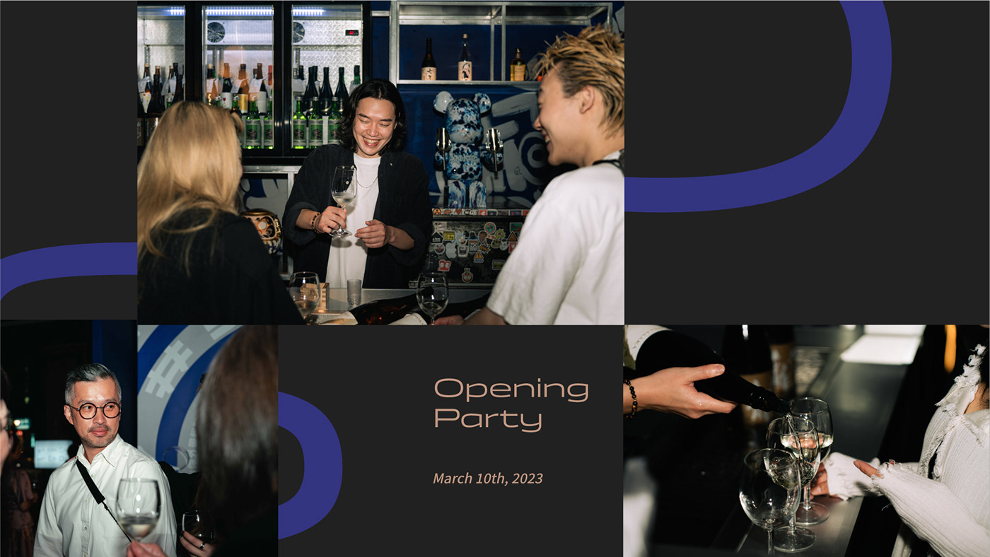
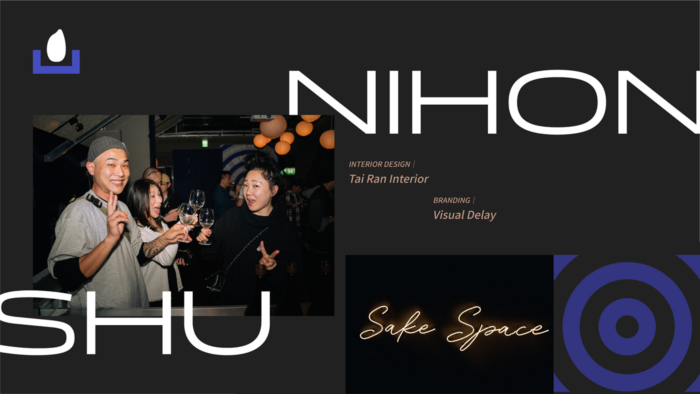
Nihonshu創立於2023年,是台北首家結合立吞品味日本清酒。
為了讓喜歡藝術及清酒的人群擁有更多元的體驗感,品牌設計與室內設計嘗試融合了不同的文化、材料和顏色,並將傳統的日本清酒文化與當代藝術、時尚、潮流街頭元素進行碰撞,為都市人們提供了一處放鬆身心、來去自如的的新式清酒空間。
Established in 2023, Nihonshu is Taipei's first venue combining standing sake tasting with Japanese culture. Aimed at art and sake enthusiasts, the brand and interior design blend diverse cultures, materials, and colors, colliding traditional Japanese sake culture with contemporary art, fashion, and street elements. This creates a new kind of sake space in the city, offering urbanites a relaxed, free-spirited environment.
設計理念 Idea of Design
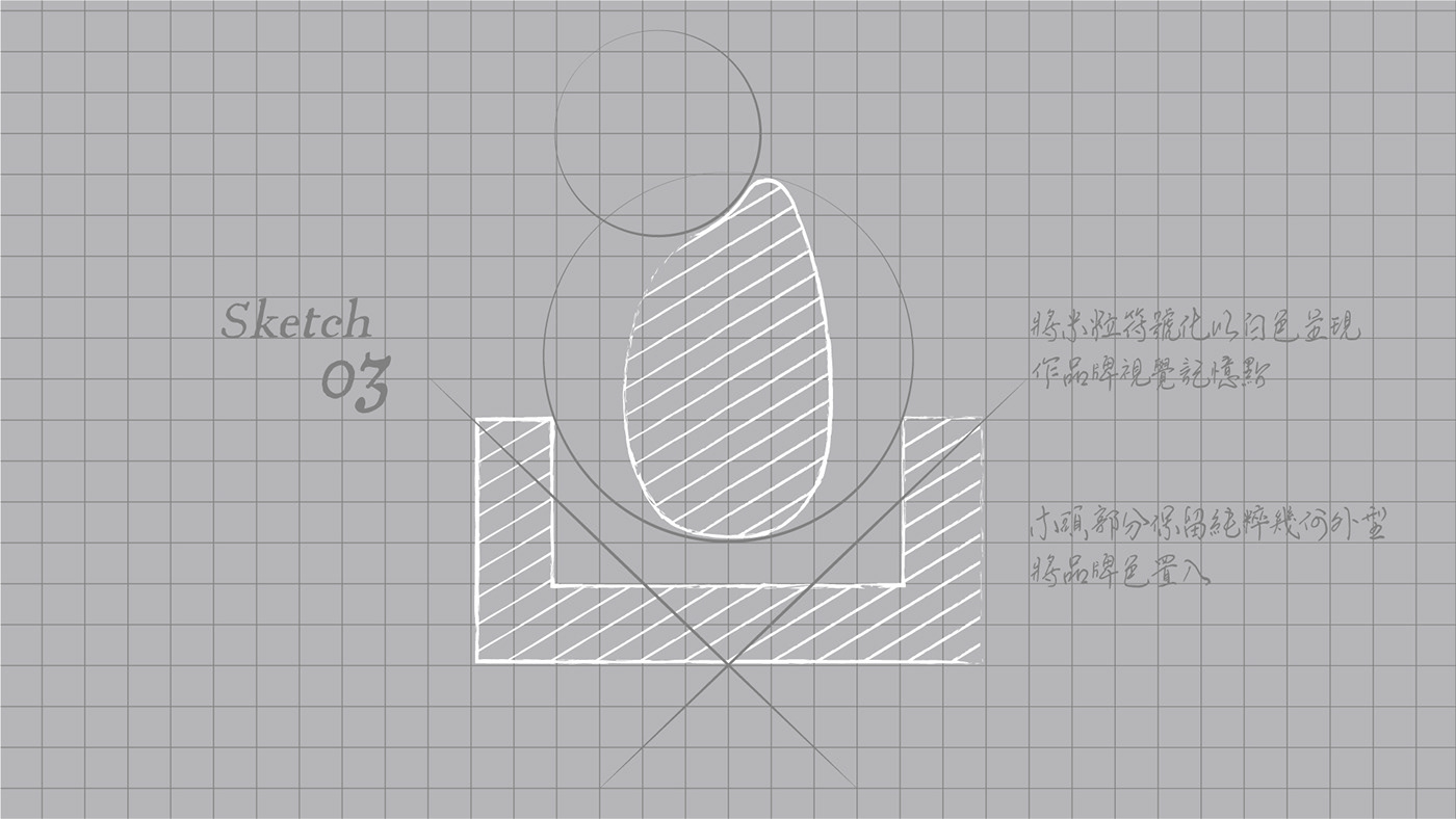
以清酒主要材料米粒為識別圖形,代表清酒的靈魂,將NIHONSHU的U與清酒的代表性酒器『木枅』連結。
木枅與米的結合呈現了清晰的行業屬性,並蘊藏了品牌好客、繁榮、慶祝之意,同時表現了主理人『慶功酒』現代業態模式。
The logo utilizes a rice grain, the primary ingredient in sake, as its identifying graphic, symbolizing the soul of sake. The 'U' in NIHONSHU is connected with the traditional sake vessel "Masu," signifying the industry's essence. The combination of Masu and rice conveys hospitality, prosperity, and celebration, aligning with the modern business model of the owner's "celebratory sake."


以啞銀卡對錶而成的名片,有如持杯時瓊漿的光澤反射,更與NIHONSHU清酒空間大量使用的不鏽鋼材質呼應,彰顯品牌當代調性。
名片下方花紋呼應地板上不鏽鋼片的紋路並巧妙的融合米粒的Logo進去。
紙張→啞銀卡 250g
印刷→數位印刷|CMYK、白
加工→對裱
印刷公司→感官印刷